Tailor your Nuxt.js application using Atomic Design and Tailwind CSS with the help of Storybook — Part 1

Deciding how your components are going to be orchestrated could be an obsessive and time-consuming task. That’s where battle-tested methods come into motion, and Atomic Design is one of them that many in the industry prefer over others.
Its creator, Brad Frost, describes atomic Design as:
Atomic design is a methodology composed of five distinct stages working together to create interface design systems in a more deliberate and hierarchical manner. The five stages of atomic design are:
Atoms
Molecules
Organisms
Templates
Pages
But what is it anyway? And how is it used? You’ve probably guessed; Atomic Design’s stages are somehow based on chemistry principles. I’m going to dig a little deeper into the concept:
Atoms
Atoms are the basic unit of chemical elements. Imagine our vast number of components in a Vue.js or Nuxt.js application; simple buttons, cards, sidebars, tables, and so much more. Our atoms in the application are components that could not be made into smaller components. Simple buttons are a prime example of atoms.
Molecules
In the real world, Molecules are groups of bonded atoms together. The same goes for our application’s components. A group of Atomic components like simple buttons and text inputs could be glued together to form a more significant entity named Search Box.
Organism
Picture our previously mentioned Atoms and Molecules. If they’re put together, we can compose a Navigation Bar from them. That Navigation Bar is an Organism in our application.
Templates
It’s better to refer to the description of Templates on Atomic Design’s website:
Templates are page-level objects that place components into a layout and articulate the design’s underlying content structure.
Let’s say we have three Organisms on an application, a Navigation Bar, a Footer, and a section that contains the content. The layout that is composed of these Organisms is a Template.
Pages
Pages are what our Templates will be when rendered with actual content instead of placeholders and basic layouts.
Now let’s dive into action and see how Atomic Design is in an actual Vue.js/Nuxt.js application. I will use Nuxt.js in this article but feel free to practice inside a Vue.js app.
Create a new Nuxt.js project with npx (or npm or Yarn) and select Tailwind CSS as the UI framework:
npx create-nuxt-app atomicNext, create three directories inside components and name them Atoms, Molecules, and Organisms:

The Button
Let’s make our first Atom inside the Atoms directory. Create a new Vue component and name it BaseButton. Its template would look like this:
// BaseButton.vue<template>
  <button class="base-button">
    {{ text }}
  </button>
</template>
Now add a prop for the button’s text:
// BaseButton.vueprops: {
  text: {
    type: String,
    required: true,
  }
}
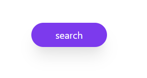
But what’s the reason for creating a button component if it doesn’t have any custom styles? I’m going to style it like the following snippet. By the way, since I’m using SCSS, first install the required loaders:
npm install --save-dev sass sass-loader@10 fibersThen, inside our scoped style, we write these:
// BaseButton.vue<style scoped lang="scss">
.base-button {
  @apply
  bg-purple-600
  px-10 py-2
  text-white
  rounded-full
  shadow-xl
  transition-colors duration-150;

  &:hover {
    @apply
    bg-purple-800;
  }
}
</style>
Notice that I’ve used the @apply directive. If you don’t have enough experience on Tailwind CSS or extracting classes, refresh your knowledge here and here. Anyway, our simple button will look like this:
Every button needs to do something that’ll make it unique. Now is the time to add a method to emit an event to the parent, notifying that the button has been pressed:
// BaseButton.vue// in script
methods: {
  clicked() {
    this.$emit('clicked')
  }
}// in template
<button @click="clicked" class="base-button">
  {{ text }}
</button>
The Textfield
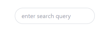
We’ll continue by creating a simple Textfield as another Atom in our application. Create a new Vue component named BaseTextField (I’m not going to bore you with details this time):
// BaseTextField.vue<template>
  <input type="text"
         :placeholder="placeholder"
         v-model="value"
         class="base-text-field"
         @input="$emit('input', $event.target.value)"/>
</template>

<script>
export default {
  name: "BaseTextField",
  props: {
    placeholder: {
      type: String,
      required: true,
    }
  },
  data() {
    return {
      value: '',
    }
  }
}
</script>

<style scoped lang="scss">
.base-text-field {
  @apply
  px-4 py-2
  rounded-full
  border-2
  border-gray-200;
}
</style>
The SearchBox
That’s enough Atoms for now! It’s time to bond our two Atoms and make a Search Box out of it. Create a new component inside the Molecules directory and name it SearchBox:
// SearchBox.vue<template>
  <div class="search-box">
    <div class="search-box__button">
      <base-button
        text="search"
        @clicked="search"/>
      <base-text-field
        placeholder="What are you looking for?"
        v-model="searchTerm"/>
    </div>
    <div class="search-box__field"></div>
  </div>
</template>

<script>
import BaseButton from "../Atoms/BaseButton";
import BaseTextField from "../Atoms/BaseTextField";

export default {
  name: "SearchBox",
  data() {
    return {
      searchTerm: '',
    }
  },
  components: {BaseTextField, BaseButton},
  methods: {
    search() {
      this.$emit('searched', this.searchTerm)
    }
  }
}
</script>

<style scoped lang="scss">
.search-box {
  @apply
  flex flex-row-reverse;
}
</style>
I’ve used BEM for the sake of more straightforward naming and reusability. If you’re not familiar with it, It can significantly help you in your following projects. It’s a short study. Start here.
We’re done with the first phase of this tutorial. Now our application has two Atoms and one Molecule composed from them. You might ask yourself: “Why all the hassle? couldn’t we do it the way we always do?”
There are two simple yet powerful reasons to do your next project based on Atomic Design principles:
- Isolation: You’ve noticed how isolated our components (Atoms and Molecules) are. This gives us the advantage of changing the components' look and functionality with the minimum side-effect on others.
- Reusability: With implementing more options in our components through slots, props, and other Vue’s capabilities, It’s possible to create reusable components across all of our applications. Though it may seem to slow our progress initially, using Atomic Design in the project eventually leads to practical reusability and saving time.
Conclusion
We’re done with the first part of the tutorial. In the second part of this article, I’ll continue with Organisms, Pages, and how all our elements will come together to form a layout.
Last but not least, in the third part, we’re going to use Storybook as a tool to view and visually test our components in total isolation.
Background vector at the top created by freepik — www.freepik.com
